


Hi there,
Full transparency: I have zero musical talent, no keyboard, and about six dead months of teenage guitar to my name.
The most musical I get is leading karaoke enthusiastically and badly.
I’m not an undiscovered talent by any means.
But I decided to test Simply Piano’s web onboarding anyway, screen by screen.
Here’s the thesis it left me with: you can’t dump the whole app’s how-to on them at once; you need to let it unfold step by step.
Most onboarding flows are full of screens that ask. Few are full of screens that use and guide you to understand the value step by step. Don’t worry, it’ll become clearer as we go.
So let’s see the key things they got right, and if you want the full onboarding flow, I’ve broken it down here. (Warning: it’s a big one.)

5 things this funnel does well
1. It reassures with proof, not platitudes
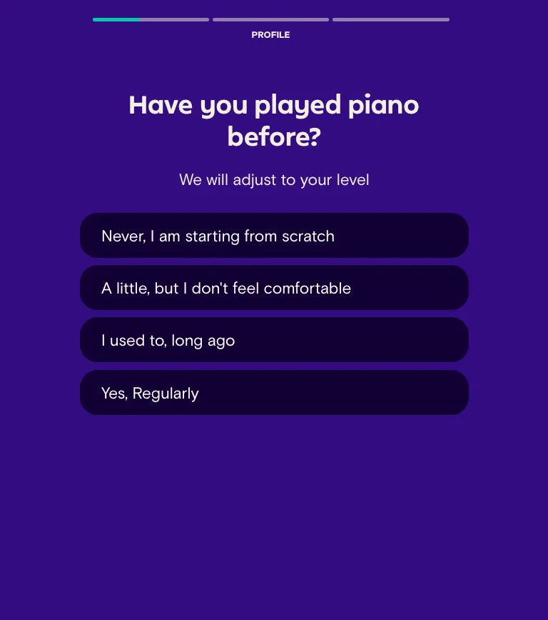
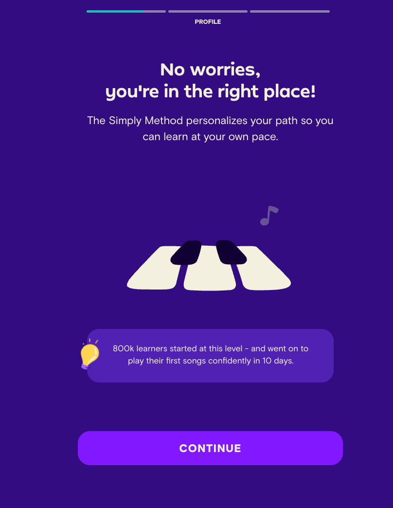
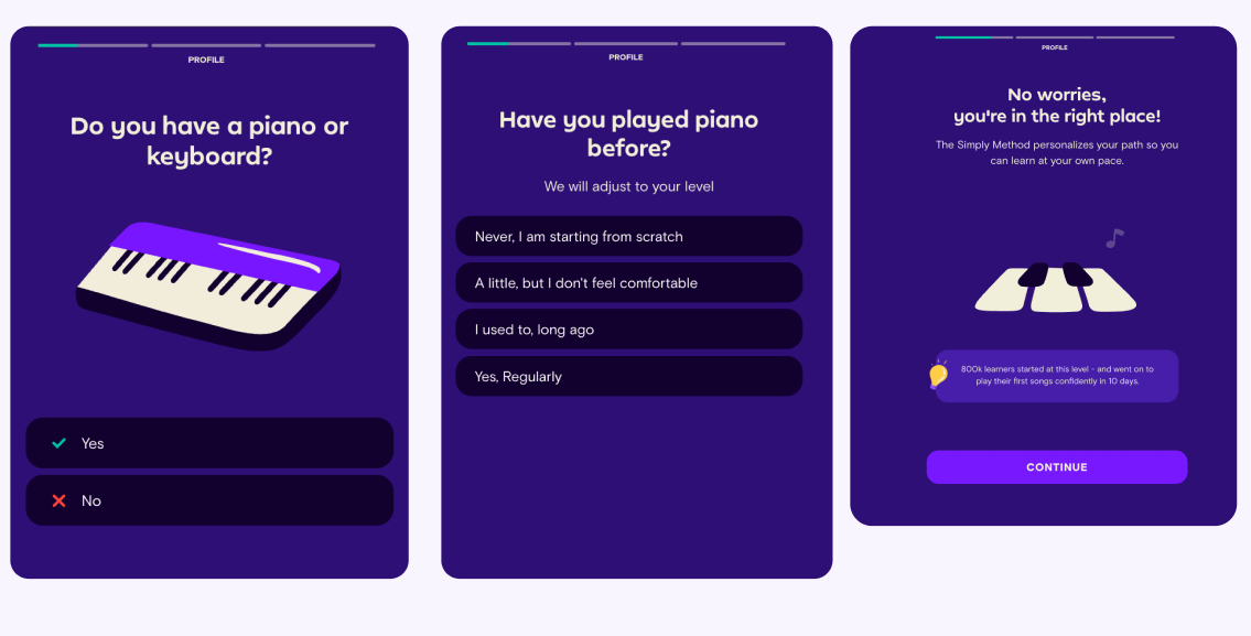
I told it I have no keyboard and have never played piano. Instead of a generic “don’t worry,” it told me how many other users are learning at my exact level.
A number beats a platitude every time.
2. It explains the product without a carousel
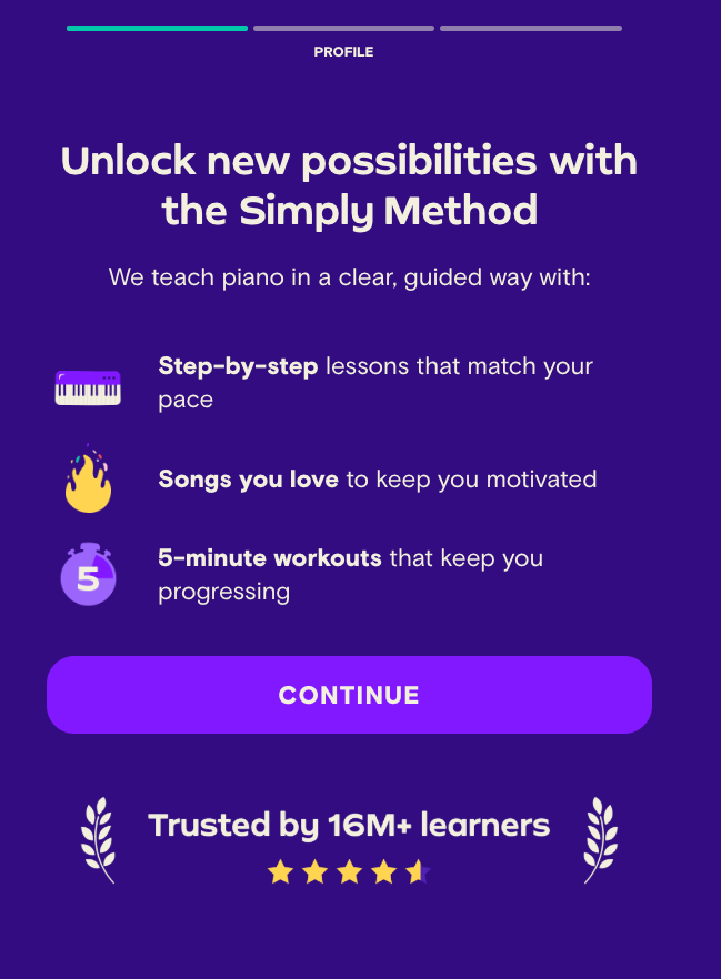
Instead of one swipeable screen listing six features, it uses a short sequence of single-idea screens: step-by-step lessons, songs you’ll know, five-minute sessions, visible progress.
One idea per screen, while the earlier reassurance is still fresh.
3. The profile screen proves it was listening
The in-between profile screen plays back the answers I’d given.
Most apps either skip this screen or fake it with a spinner and vague copy.
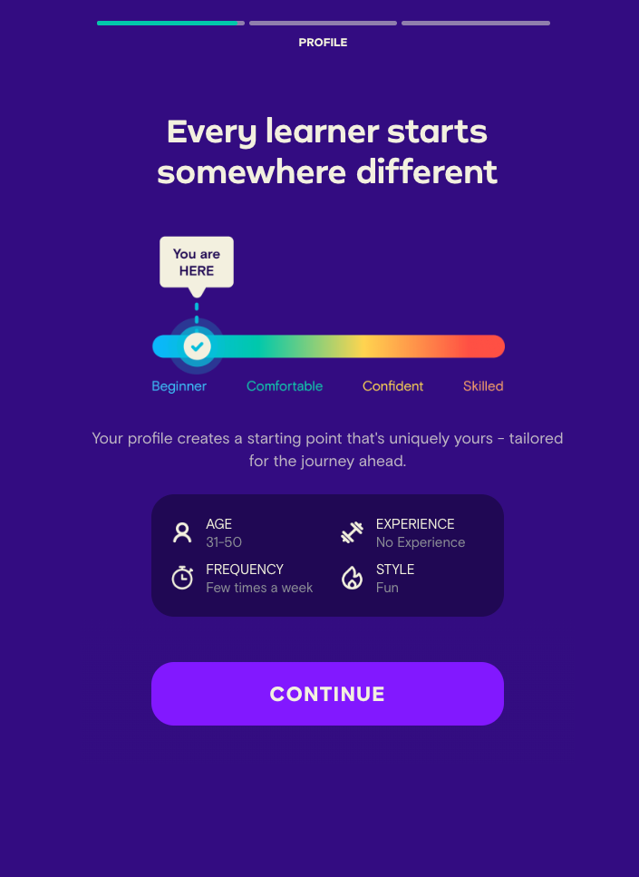
4. It gives a fast, specific win before the paywall
Right before asking for money, it lets me choose my first song from a set of options tailored to what I’d already told it. It pairs that with a concrete promise: I’ll be able to play it in one day. That’s far more compelling than a generic “start your journey.”
Nice touch: the piano in the background changes to the song I picked.
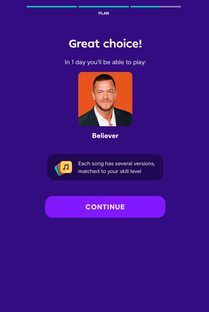
3 things I’d fix (if data backs it up)
Nothing’s perfect, so let’s discuss what I’d change on Simply Piano’s app.
1. The paywall stacks too many decisions into one screen
A free trial on the annual plan but not the monthly, fine. Savings shown clearly, fine.
But then a family plan appears with zero prior context; nobody had asked if I had one, and a trial-extension option gets layered on top.
Three decisions on one screen undo the “designed by teachers, here to guide you” reassurance stacked right above it.
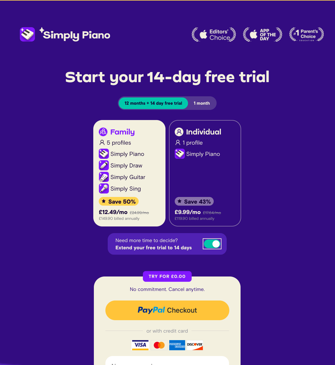
2. Rounded numbers can decrease trust: “5,000”, “10+”
I personally find this looks fake. What actually convinced me was the row of real artist photos and names underneath. As well as stating the new ones added, something like “273 songs added in the last month” would prove to me that they have a wide range of ever-updating content.
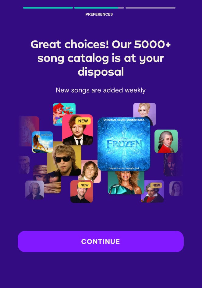
3. Never answered how I’ll use it
I told the app I didn't have a keyboard, and while it did a good job reassuring me (see above), it never explained how I'd actually use the app without one. I know from the Sub Club podcast that there are online ways to practise, but this wasn't mentioned during onboarding, which left me unsure how I'd get started.
💡 What I’d recommend this week
If you love a good onboarding breakdown, so do I. You can find five more web-to-app breakdowns here.

Every screen in an onboarding quiz either collects information, uses it, or provides value.
Collecting is easy and cheap to build. Using it is what actually earns trust, and Simply Piano only pulls it off well most of the time. Not only that, they help you understand the app better as you go to get a feel for what it looks like and how it works.
If you’re auditing your own funnel this week, go screen by screen and ask which bucket each one falls into.
If more than half are “collecting,” you’ve built a survey, not an onboarding.
Speak soon,
Daphne
Great feedback on the numbers looking fake. I always had the same impression, so it's really nice to read that from somebody like you. The only thing I started to do is shorten the really big numbers to "289K" because "289,145" might look more accurate, but is also a lot more to process for the user. But also not sure what the best way is.