


Hi there,
When I first started out consulting, my “brand” was basically me and a lot of scrappy late nights with the support of my now-husband (thanks, Marty).
It was fun, approachable, a bit playful, and packed with insights. And for a while, that worked.
A brief visual history
Here is one of my first-ever Linkedin carousel designs:
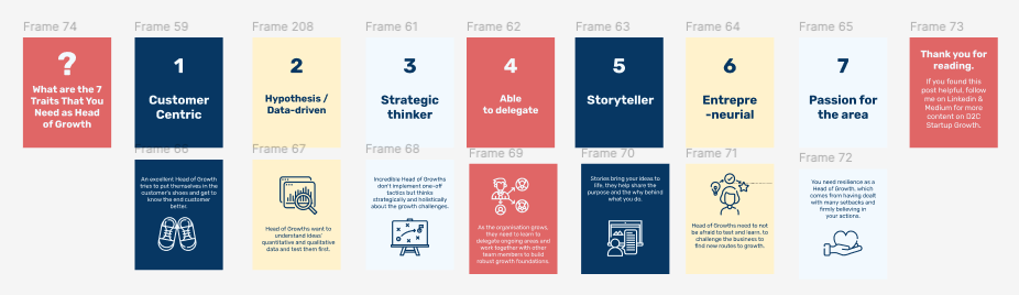
It got a little bit fancier a few months later:

Over time, I tried to level things up: a new logo, an upgraded carousel design, a bit of professional polish. Here was V3:

But recently, during a LinkedIn audit (where we give each other feedback to improve) with a fellow growth friend, she made a great point that stuck:
“Your branding feels a bit childish — not quite matching the authority of your content.”
She was right. And it hit me: my branding wasn’t supporting my work anymore. It was holding it back.
I noticed contrast issues, readability problems, and (at times) a tone that didn’t quite match where I wanted to be.
I’ll be honest: as a growth person, I’ve never obsessed over branding. It’s harder to measure, and I tend to focus on what’s trackable.
But in a world where AI is stronger than ever, your personality matters more than ever. I wanted mine to come through clearly. Branding has the power to do that.
From that moment on, I did what I’ve seen many clients do when they undergo a rebranding: I started hating my old branding.
The process
So I sat down with a fantastic brand designer Kayley Kemple (who I can’t recommend enough!).
I shared my vision, and we went through several moodboards:
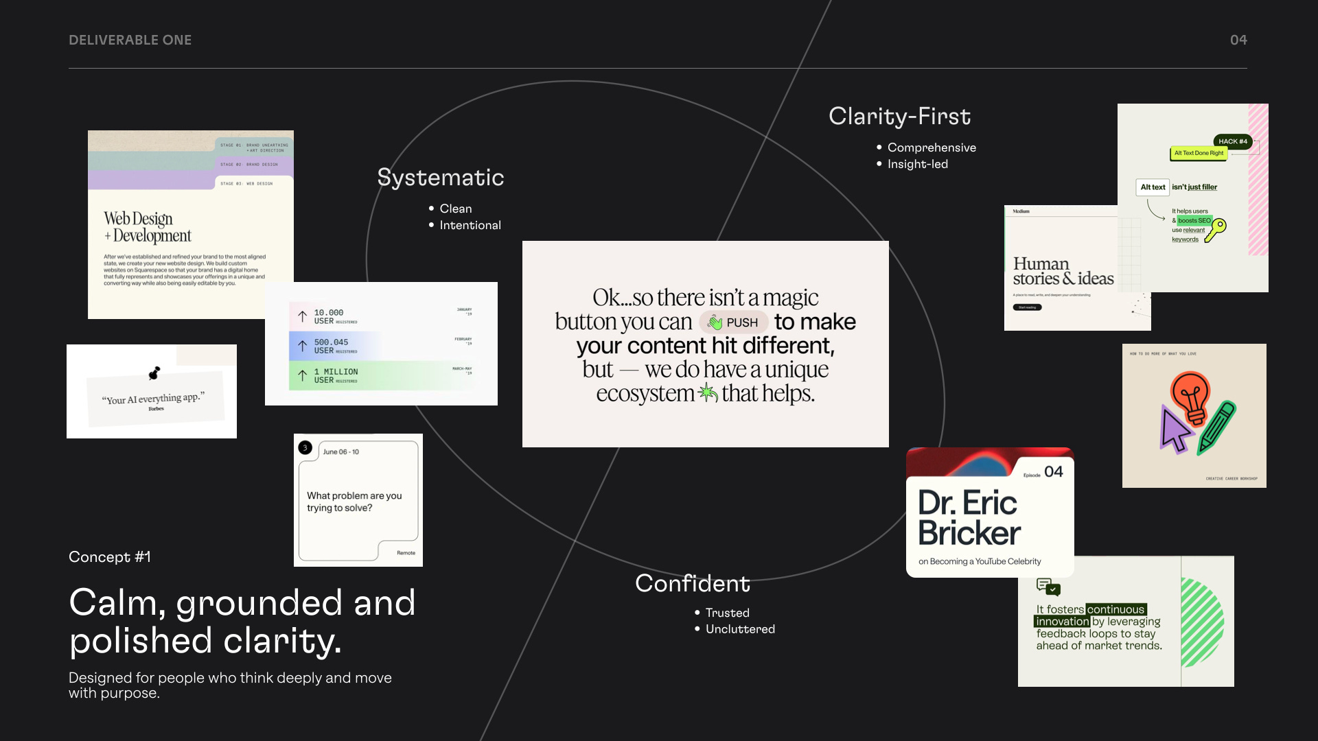
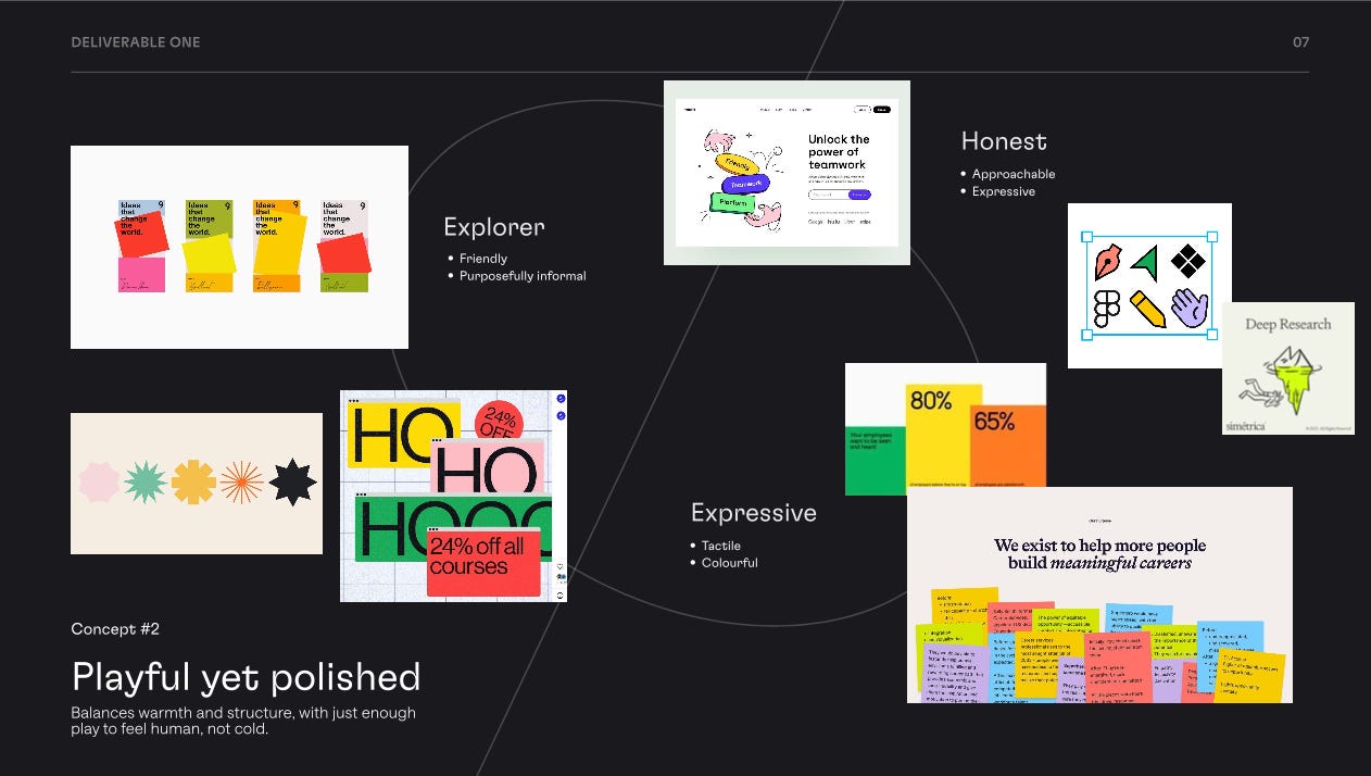
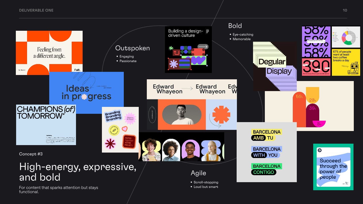
In the end, I liked option two with a bit of three. It brought across more of what I wanted to portray:
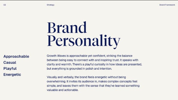
Over the course of two months, she helped me shape a brand that feels like home.
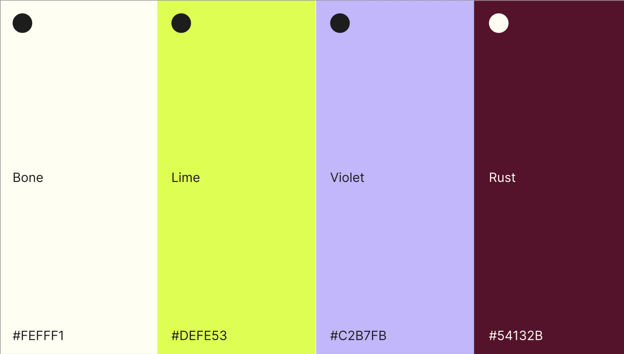
I struggled a bit with finding the right colours. Initially, the new version was this:
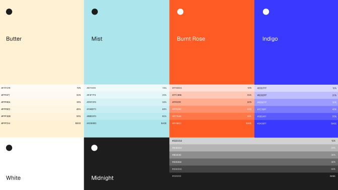
In the end, after a few different options, we worked out the right mix (also as a Dutchy love that it includes orange now… I meant Burnt Rose):
It’s such a personal thing, and I’m so happy how she brought to life my brand in a way I never could have imagined:
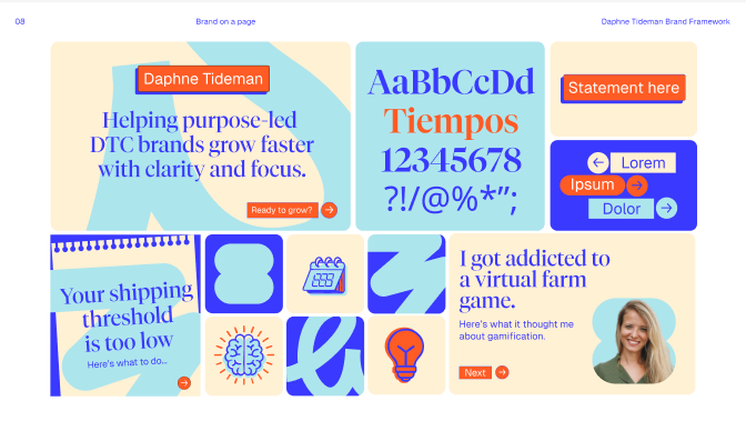
I was so scared to share it today (got a bit of imposter syndrome), but I did on Linkedin this morning:
What this means for you
This isn’t just about new colors or a prettier logo. My hope is that the new look makes everything you read from me:
Easier to digest → better contrast, scannability, clarity
More enjoyable to engage with → playful visuals that pull you in
More valuable → because branding that gets out of the way lets the insights shine
Of course, it’s just me behind the scenes updating this all so you’ll see things update piece by piece as I roll it out between client work and writing.
My website has had its first jazzing up:
Which, after 10+ hours of work on it this week, is making me debate switching from Squarespace… I may experiment with testing an AI-generated website later this year.
But first, I’ll continue to improve and fine-tune this version.
Recommendation
This week’s recommendation had to be about rebranding, of course.
If you’re wondering whether your rebrand is just for show or truly necessary, this article is a great checklist.
It walks you through 12 clear indicators, from feeling embarrassed by your own branding to losing pricing power, to help you determine if you need a rebranding.
For me, it was mainly point 6.
Your turn
I’d love your honest feedback. I’m super Dutch and direct, so please be the same with me.
My goal is simple: to add value. If this rebrand helps me do that better, great. If there are ways I can continue to improve, I want to hear them.
To be clear: I don’t see a rebrand as a magic fix.
What matters far more are the intentions behind it. Knowing what you want your brand to represent and ensuring the design helps bring that to life.
The new designs and feel are just one part of my ongoing mission to improve my approach continually.
Thanks for being here through the scrappy beginnings, and here’s to the next chapter.
See you next week,
Daphne