


Hi there,
Whenever a brand has a comparison chart on their website I get super excited.
Thank you for saving me unnecessarily googling and searching for how you differ (or having to ask if Chat GPT has any idea).
But that excitement quickly turns to dismay… some are absolutely useless:
Vague comparisons
Everything they do is marked as great vs competitors are just a load of red crosses
A load of features
Comparing them to brands I’ve never even heard of or care about
Not easy to use on mobile
Urgh… I’d rather not have one, you’ve just wasted a scroll or two for me to get past it.
Check out Simba’s, huge mattress brand, but not the best of charts (in my humble opinion):
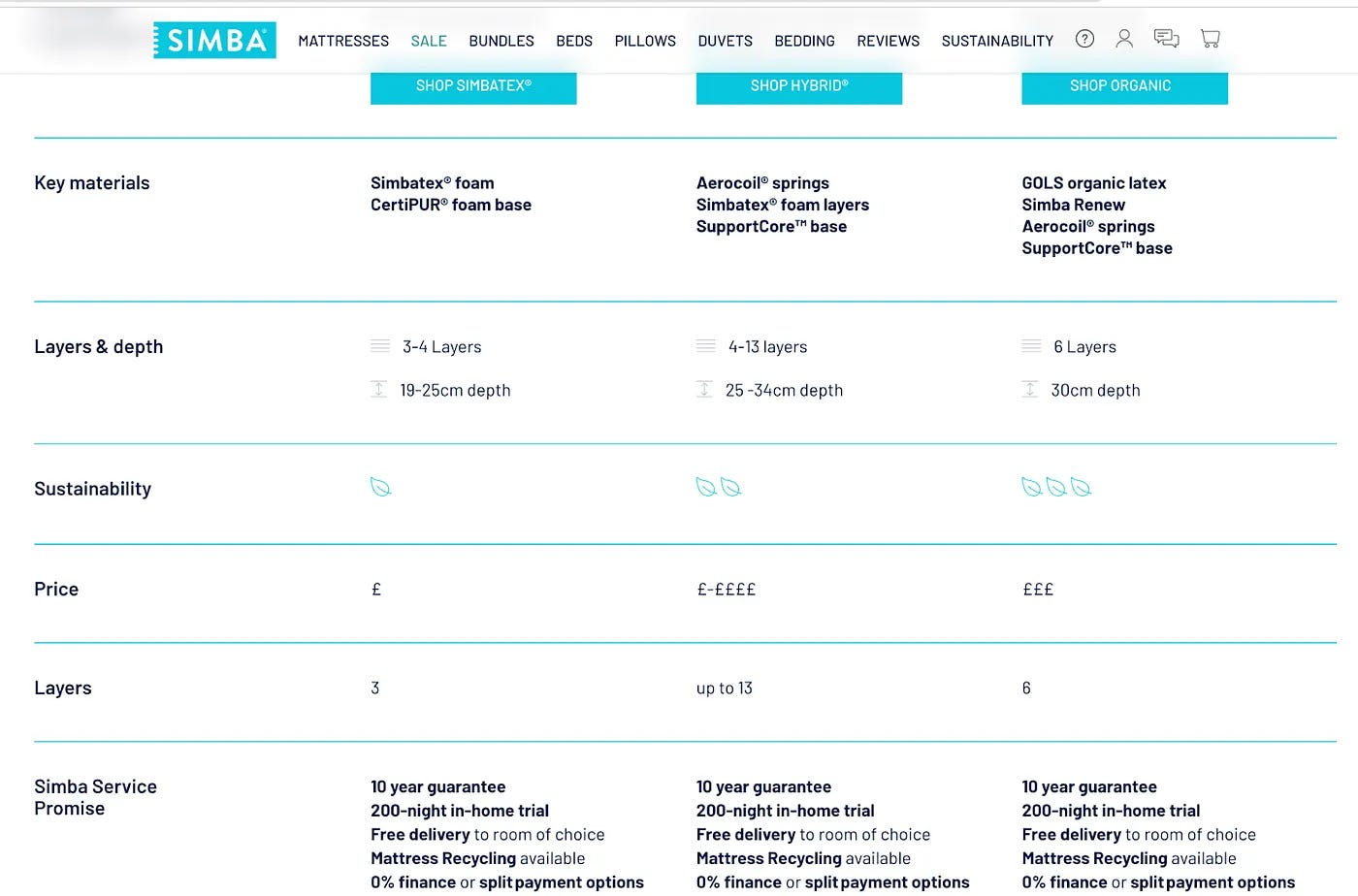
Mattress thickness layers (which are weirdly listed twice), talks of depth and material… But what about firmness? Ergonomics? Comfort? Nothing.
That got me thinking, though… comparison tables are so powerful, but how do you do them right?
Here are my top tips:
1. Compare to different solutions on different pages
Your homepage is top of the funnel, so you may not even compare to direct competitors there but instead to alternative solutions vs on your product page you might compare to more direct competitors. It will also of course vary per audience what they are comparing you to.
For example, for Whole Supp, direct competitors might be brands like Huel, YFood and JimmyJoy to name a few. But a broader comparison might include indirect competitors too, such as a healthy food diet or protein shakes.
2. Don’t be a bully
I know it's tempting to hate competitors, but they wouldn’t be competitors if they were absolutely terrible. Be real, what do they do well and less well? It just makes it more trustworthy. You don’t have to scream their praises but at least throw in a few things they either do well in or are neutral at.
3. Get concrete
Ticks and crosses can work, but I love a concrete comparison chart with exact numbers and facts in there, based on key benefits vs just features.
4. Get visual
Try to include their logo or some type of visualisation in it helps people stop scrolling and focus in on it.
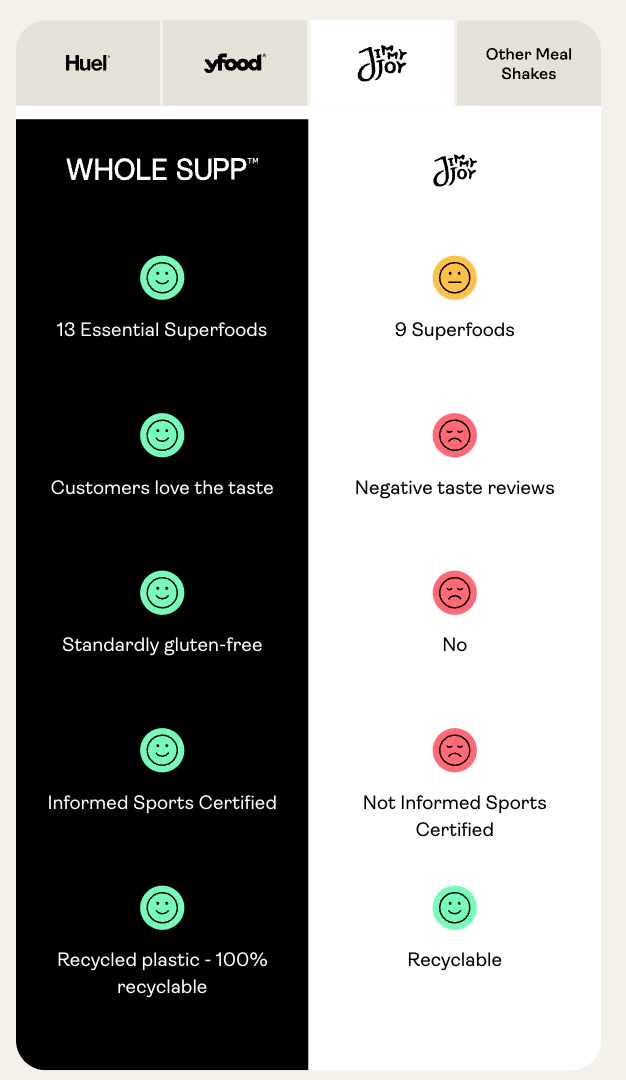
We recently redid the comparison chart on mobile at Whole Supp with our lovely dev agency, Greenbox Designs. The logos allow you to easily switch between brands plus quickly recognise competitors,
Recommendation
Why stop at the comparison chart, there is so much impact to be made with improving your landing page. So I thought I’d leave you with some more inspiration.
I recently found this resource, 300 DTC landing pages… and you can sort by category:
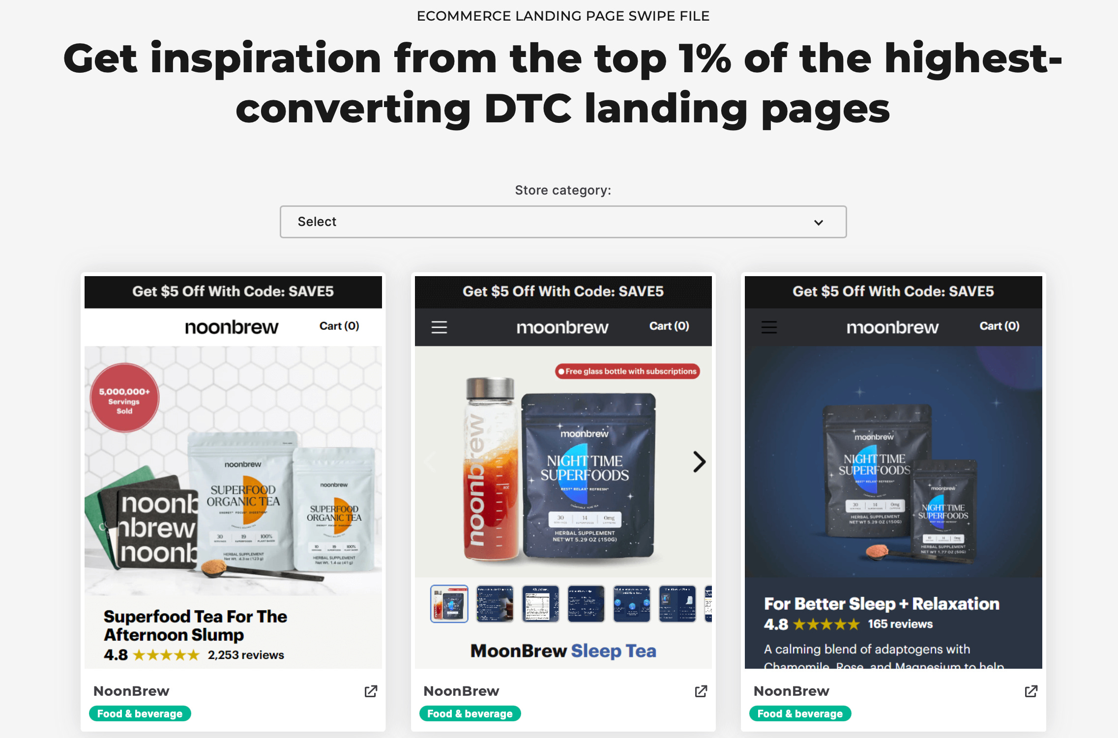
There goes my Thursday evening.
–
Compare right - gain trust. Compare badly - lose trust. It’s that simple.
Comparison charts are powerful when used right, but need to be worked out carefully. They are also just one format, depending on your audience you may be better off focusing on full article comparisons or for a sceptical customer, letting your customers share how they felt you differed vs others.
Happy comparing,
Daphne