


Hi there,
I spent 16+ hours going through Noom’s onboarding flow. Typical Daphne style: I obsessed about it, testing every combination of answers I could. I even created a mega board of the whole flow that I shared a video on:

113 screens. Up to 15 minutes for a typical user. And somehow, I never wanted to quit.
That’s not normal.
Their secret? They don’t just collect data. They give value back at every step. ‘
Here’s how.
1. The payoff isn’t at the end — it’s everywhere
Most onboarding flows follow a simple formula: ask questions first, deliver value later. Users fill in fields and tick boxes, then wait for the reward at the end.
Noom flips this.
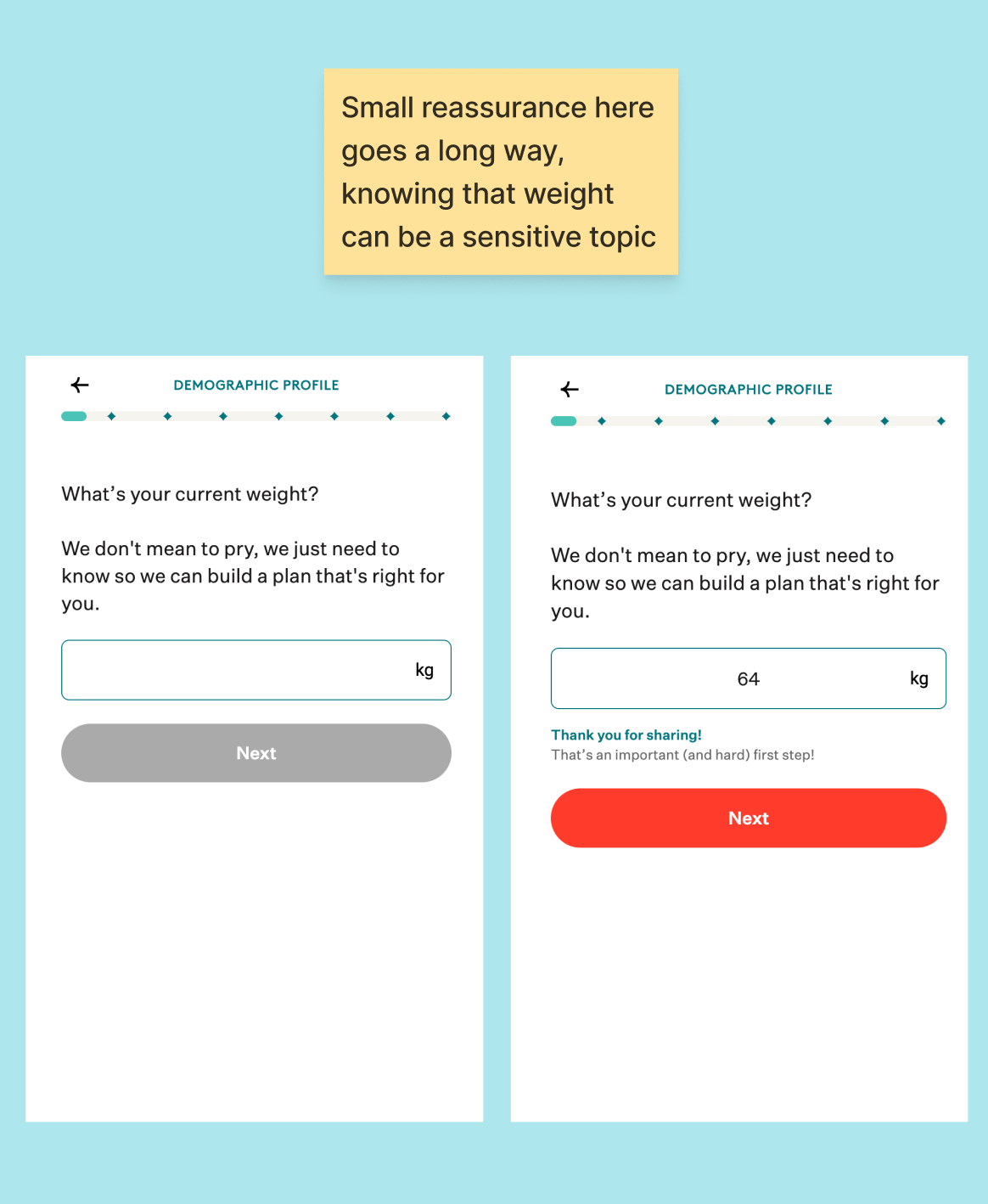
After you enter your weight (a vulnerable moment), the app immediately responds: “Thank you for sharing. That’s an important (and hard) first step.”
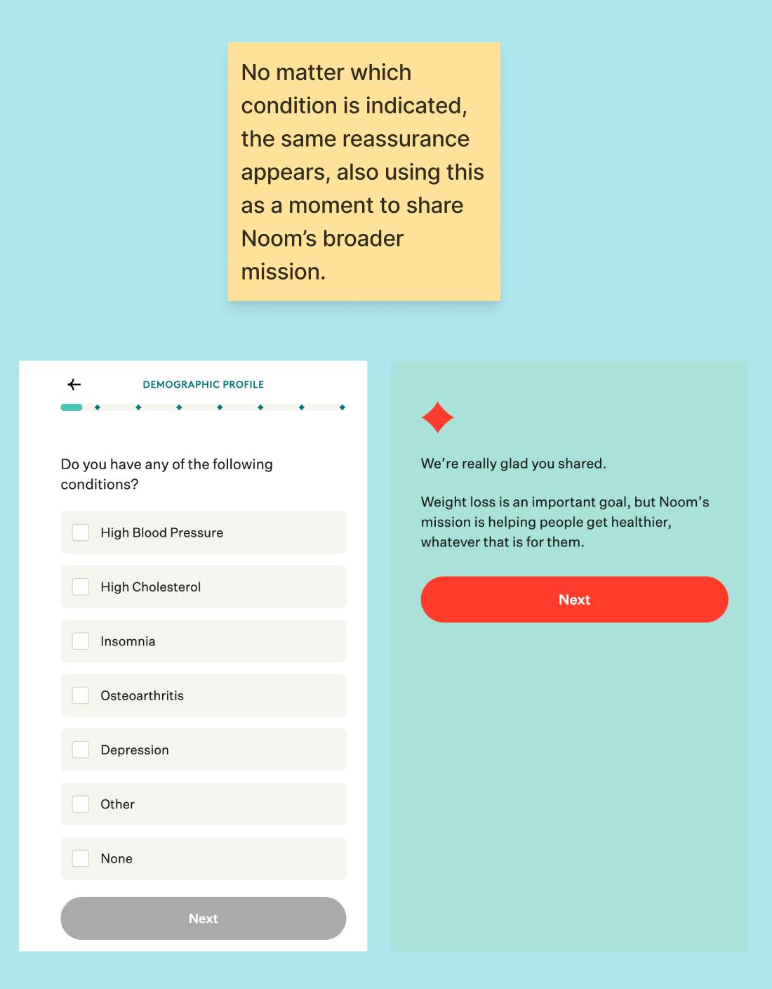
When you share a health condition, you see: “We’re really glad you shared. Noom’s mission is helping people get healthier, whatever that is for them.”
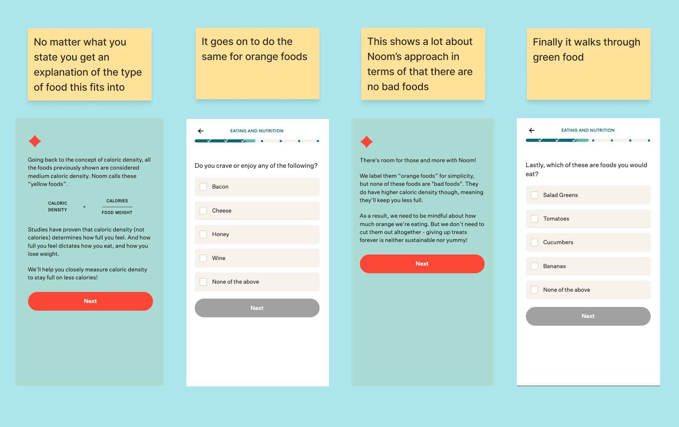
When you answer questions about your eating habits, the app teaches you something — explaining calorie density, showing you why grapes keep you fuller than raisins, and introducing their green/yellow/red food system.
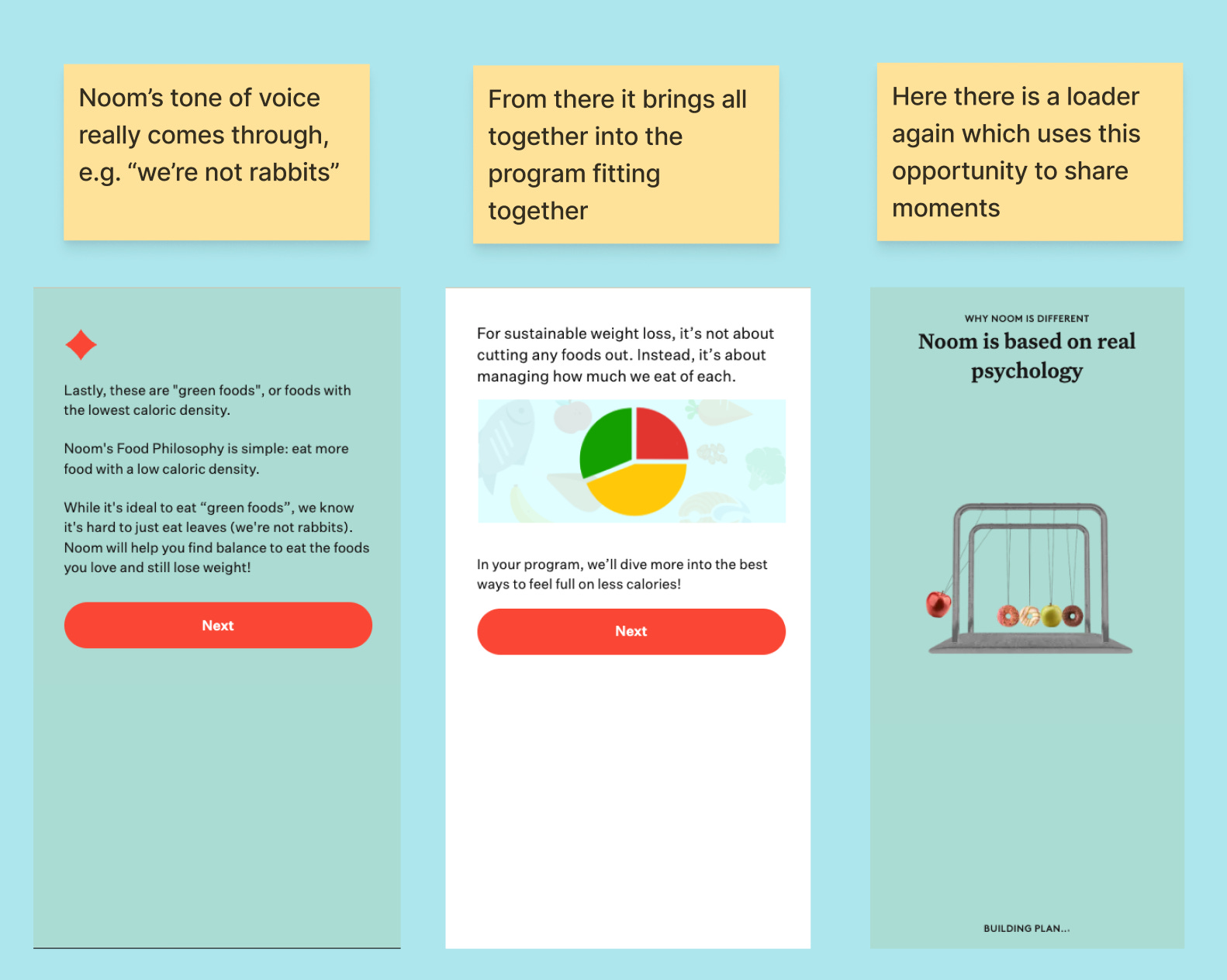
Almost every screen either:
Acknowledges what you just shared
Teaches you something new
Shows you your progress
The result? Users aren’t just answering questions. They’re learning the method, feeling understood, and watching their personalised plan take shape in real time.
2. Small wins that keep you moving
One detail I loved: every few screens, Noom shows an updated projection of when you’ll hit your goal weight. So the initial prediction:
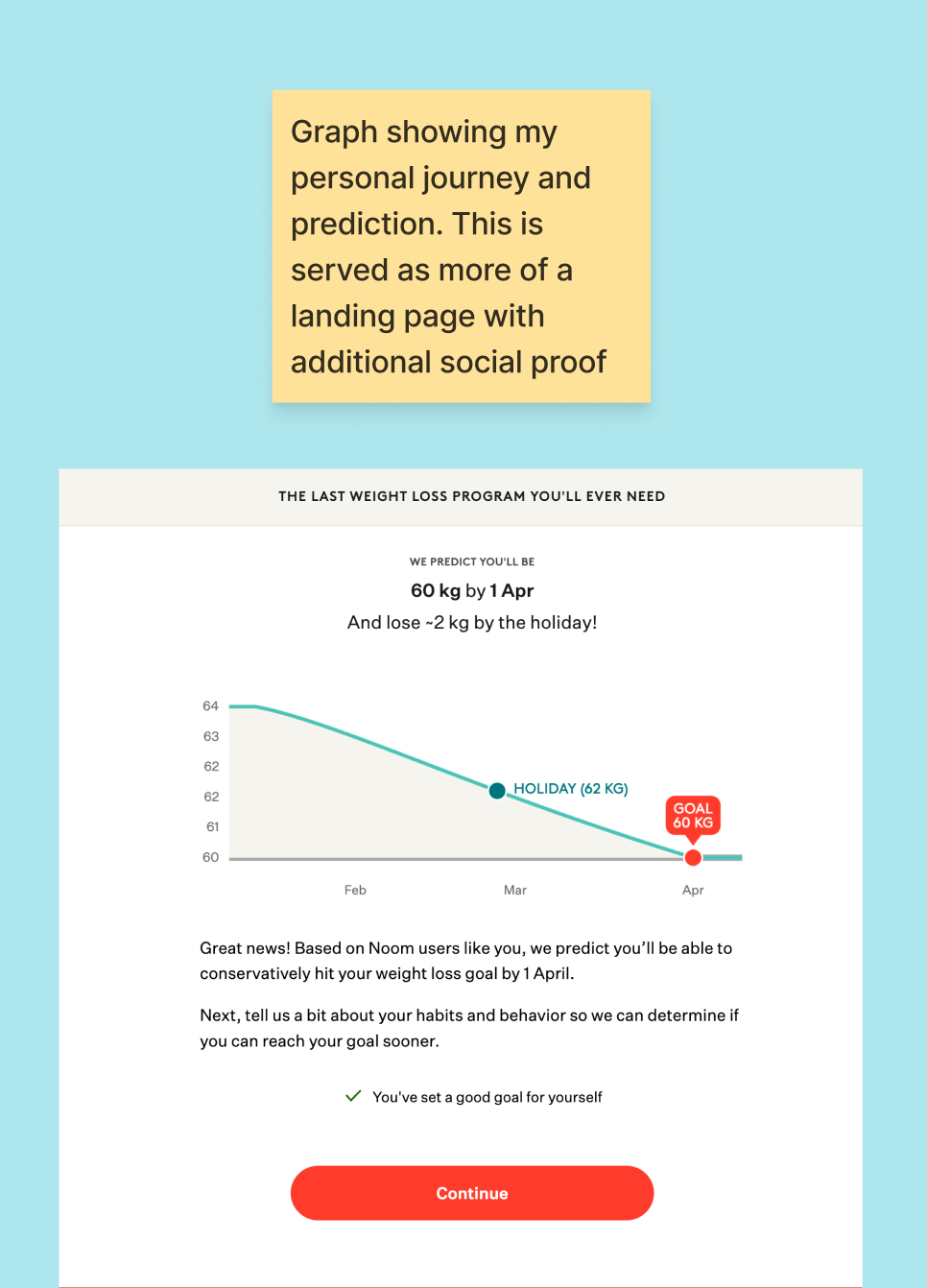
And then 21 screens later:
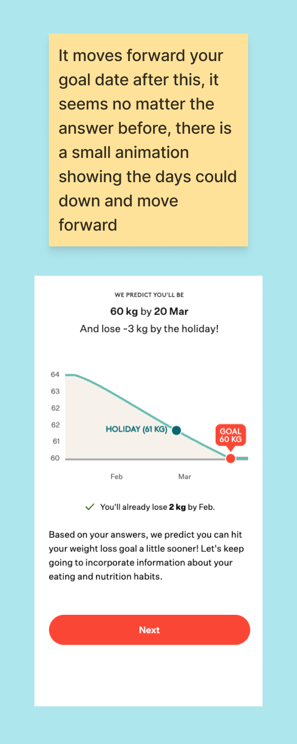
The date keeps moving closer.
Not because you’re giving “better” answers, but because the app is showing you that your input matters — that you’re building something together.
It’s a small psychological trick, but it works. You feel momentum, like the app is working for you, not just extracting data.
They do the same thing with their “building your plan” loading screens. These aren’t just spinners; they show progress bars for each section you’ve completed: demographic profile, weight loss goals, and eating habits. It’s a simple way of making it clear that all those questions are actually going somewhere.
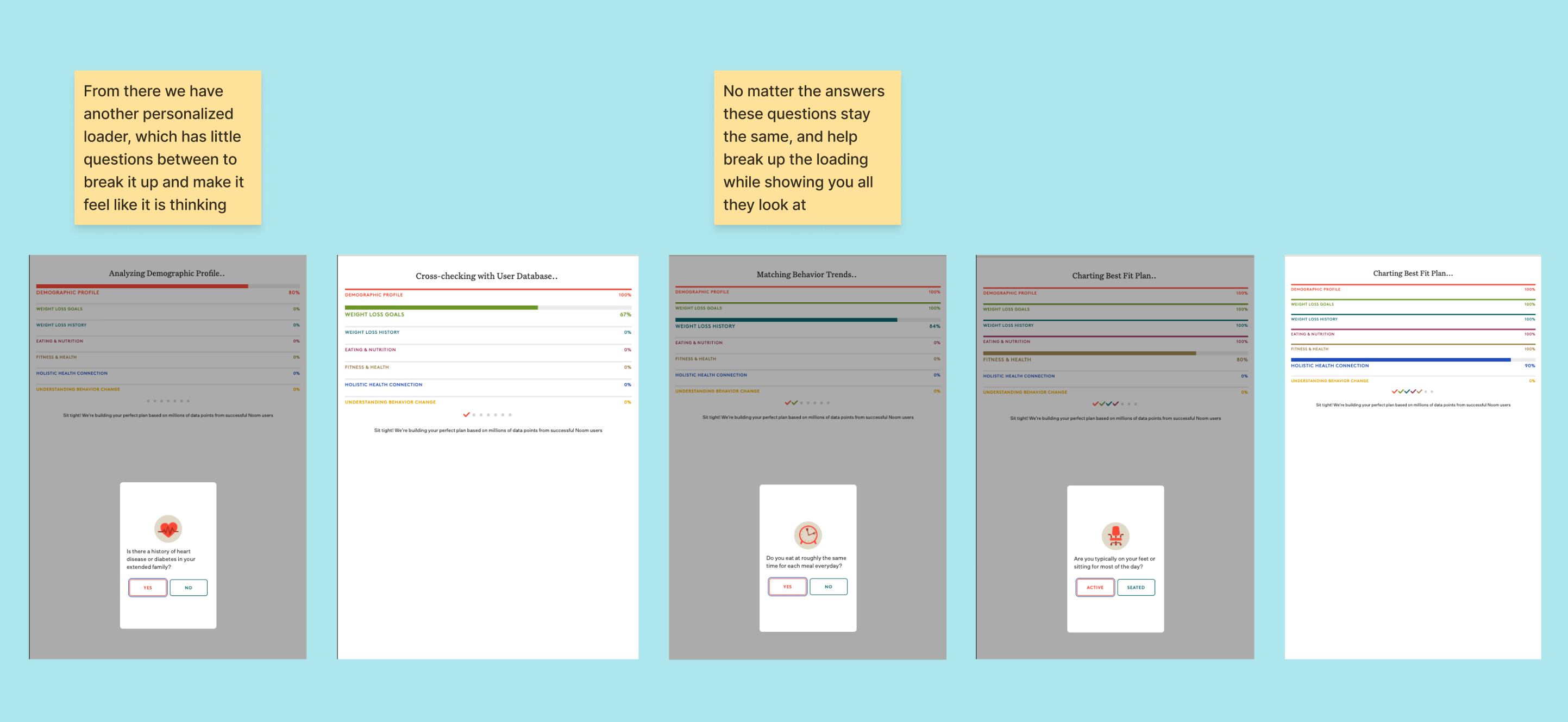
Even if some of this is theatrical, it makes the personalisation feel earned.
You can see the full visual breakdown here.

Why this matters for your onboarding
Most startups have an onboarding process that is long overdue for renewal. They are short and sweet, conscious that every additional step is a potential drop-off point.
But the lesson from Noom isn’t “make your onboarding longer.” It’s this:
Every question you ask should deliver something back.
That could be:
A reassurance message after a sensitive input
A visible update to their personalised result
A small piece of education that makes them smarter
A moment of “you’re not alone” social proof
If a question only extracts value without giving any, cut it or move it later. But can you turn a question into a micro-moment of connection or insight? That’s not friction. That’s investment.
This might not increase your onboarding completion rates, but if you do this well, it will increase your activation rates, paid sign-ups and potentially retention.
What to take from this
If you’re building an onboarding flow (or auditing an existing one), ask yourself:
What does the user get back after each input? If the answer is “nothing until the end,” you have a problem.
Where are the vulnerable moments? Weight, income, health, relationship status, these deserve acknowledgement, not silence.
Can you show progress visually? A percentage bar, an updating result, a changing date — anything that shows their answers are actively shaping their experience.
Are you teaching or just asking? Noom’s food questions double as education. By the time you finish, you already understand their method.
Length isn’t the enemy; emptiness is. Greediness is asking and asking without giving and guiding.
Recommendation
In every edition of Growth Waves, I also share a resource to check out related to the week's topic.
I wrote a full teardown of Noom’s web-to-app funnel for RevenueCat — all 113 screens of it.
It goes much deeper into:
How they handle sensitive questions (gender, pregnancy, eating disorders)
The “pay what you want” trial pricing psychology
Where the flow falls short (spoiler: I still don’t know what the app actually looks like)
Specific patterns you can apply to your own onboarding
Take a moment to go through your onboarding and ask yourself: how does it feel to complete this? Does it feel like a chore, or does it build excitement and curiosity?
I’m not saying you need 113 screens like Noom (long onboardings aren’t always better). Rather, consider the mechanisms they use and how you can apply them to improve your own onboarding.
Till next time,
Daphne