


Hi there,
Most paywalls are forgettable. You’ve seen them a hundred times: a few bullet points, maybe a “Most Popular” badge, and a trial button. Some version of this:
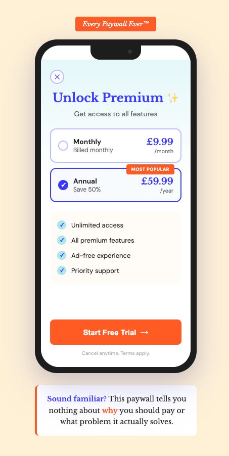
They exist to get you to pay, and it shows.
But the best paywalls don’t feel like that:
They feel like the app gets you.
They answer questions you didn’t know you had.
They make you want to keep going.
The difference? The best paywalls aren’t designed to sell. They’re designed to convert doubt into confidence.
Today, I’m breaking down the four elements that separate high-converting paywalls from forgettable ones, with examples you can learn from (and a few you might want to steal).
1. They sell the job, not the features
This is the mistake I see most often: paywalls that list features instead of outcomes.
“Unlimited access to all lessons” tells me what I get access to… It doesn’t tell me why I should care.
Smart Tales, an educational app for kids, discovered this through user interviews.
Their initial paywall focused on math, science, and reading content.
But parents didn’t care about that. What they cared about was avoiding the screen switch-off meltdown. The app helped kids have non-addictive screen time, so putting the iPad away didn’t trigger a tantrum.
Together with Léa Samrani advising them, they rewrote their paywall around that job-to-be-done, and they saw a 72% increase in free-to-paid conversion.

The question to ask: What problem is your user actually trying to solve? (Hint: it’s rarely “access to features.”)
2. They build trust before asking for money
You’re asking someone to hand over their card details (or at least double-tap to use Apple Pay). They need to trust you first.
The best paywalls address this head-on with:
Social proof (ratings, review count, “loved by X users”)
Clarity on how trials work, if offered (when they’ll be charged, how to cancel)
Reassurance (money-back guarantees, “we’ll remind you before your trial ends”)
Blinkist pioneered the “Honest Paywall” approach: a clear timeline showing exactly what happens during the trial, plus a guarantee they’d remind users before charging.
The result? 23% higher conversion and 55% fewer complaints.'
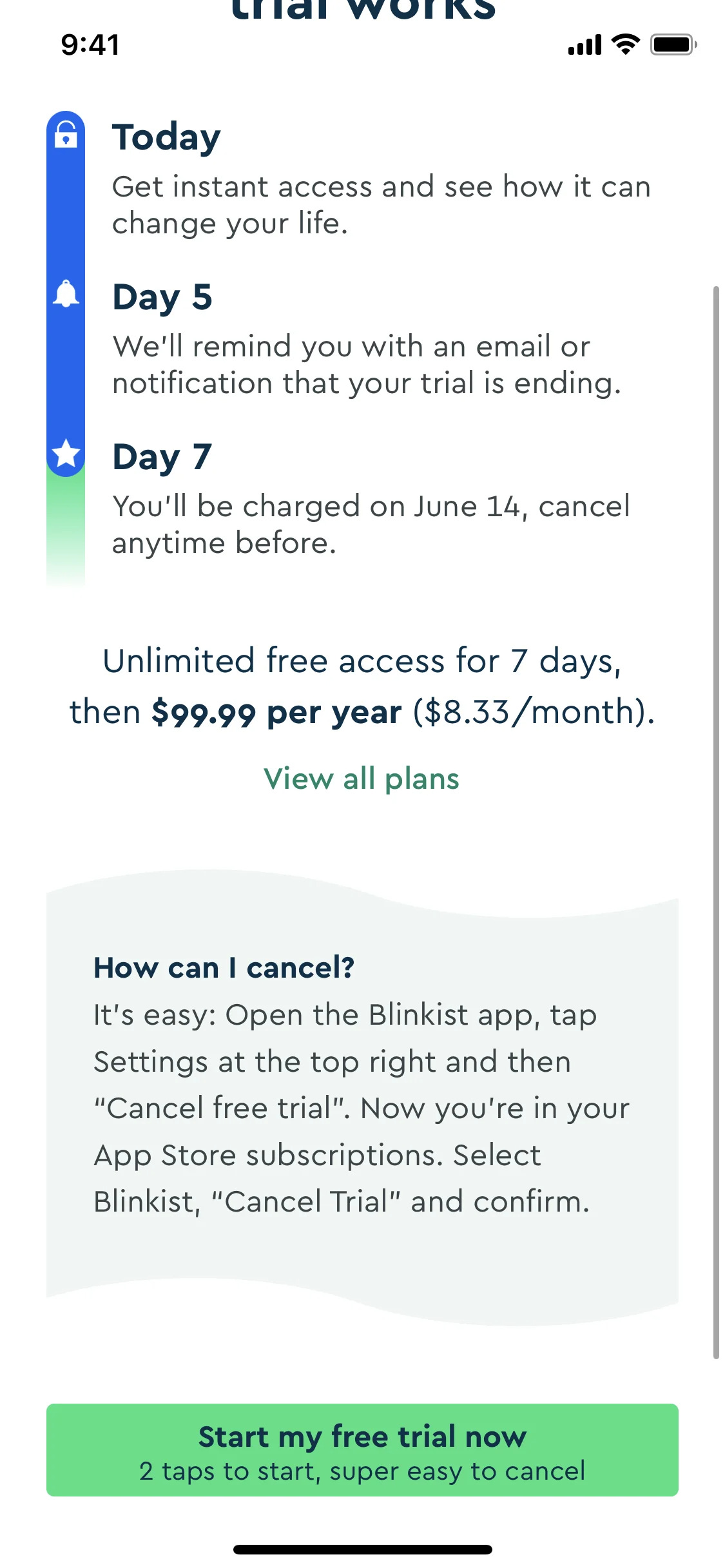
This isn’t about good ethics (every paywall should be considered ‘honest’ in my opinion), rather it’s about ensuring users feel informed and trust you through clarity.
The question to ask: Does our paywall reassure the user and build trust?
3. They make the decision easy
Most users have no idea which plan is right for them. Your paywall should make it obvious. The best paywalls:
Lead with one clear recommendation (usually annual)
Frame the price comparison helpfully (”Save 50%” or price per week)
Reduce options (too many choices = no choice)
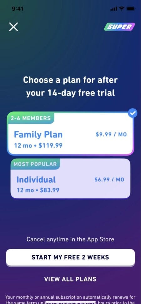
Duolingo does this well. They show the trial length directly in the CTA button, they do the classic highlight “Most Popular,” and break down annual pricing to a weekly figure. No mental math required.
When you give options, it needs to be easy to understand what option is right for you, for example Peloton even gives the option to compare plans on their paywall of App+ vs App One:
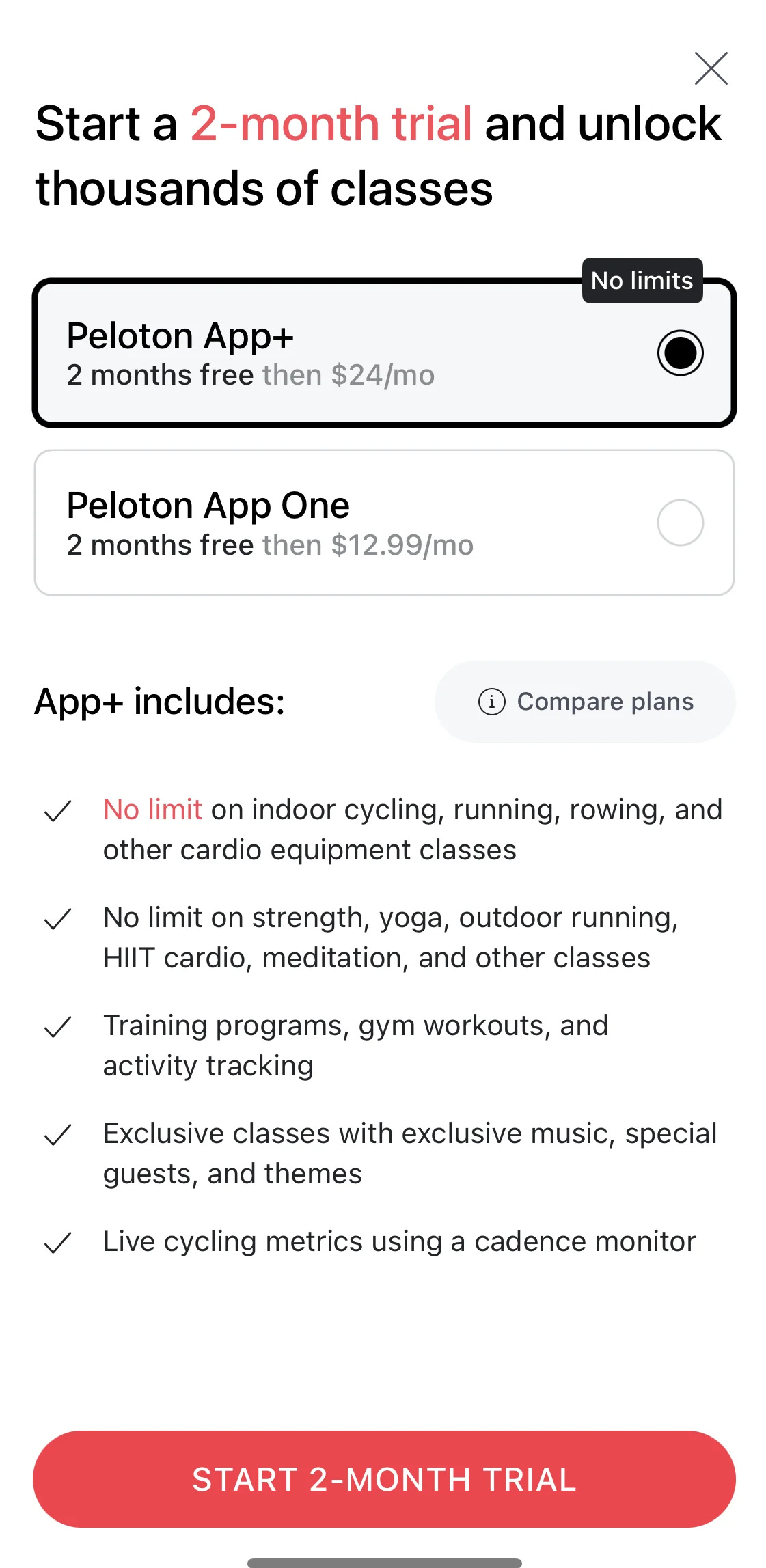
This opens up a clean comparison table overlay over the paywall to help you better understand the differences:
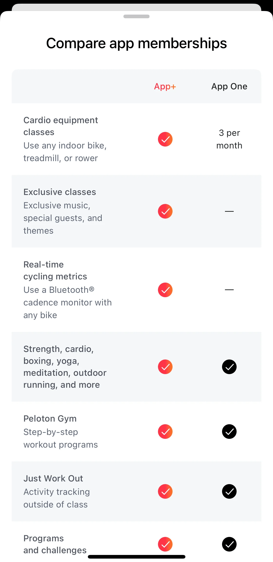
The question to ask: Do I help them identify which option is best for them?
4. They match the moment
A paywall immediately after download needs to do different work than one someone sees after using your app for a week.
Early in the journey: Focus on education and trust. Users don’t yet know what you offer.
After the aha moment: Focus on reinforcing progress and urgency. They’ve felt the value; now help them commit to it.
AllTrails nails this. After you’ve completed a hike, their paywall says: “AllTrails+ members are 3x more likely to hit the trail.” It connects the premium offering to the progress you’ve already made.
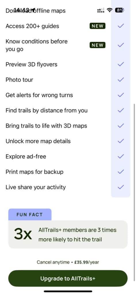
For apps where the aha moment takes time, consider delaying the paywall and adding more guidance upfront.
The question to ask: What needs to change about our paywall once users understand the main value of the app?
What to take from this
If you’re auditing your paywall, ask yourself:
Are you selling the job or listing features? Rewrite your headline around what users actually want to achieve.
Where’s the trust? Add social proof, clarify trial terms, or include a guarantee.
Is the decision easy? Reduce options, lead with a recommendation, and frame pricing clearly.
Does your timing match the journey? Test paywall placement based on where users hit their aha moment.
Recommendation
In every edition of Growth Waves, I share a resource related to the week’s topic.
If you want to go deeper on paywalls, I wrote a piece last year on how the top apps approach them differently, sharing insights from Rosie Hoggmascall, Head of Product at Fyxer, who’s worked with 20+ subscription apps:

And if you want more visual inspiration, I personally use Mobbin (not a sponsor) to see how 100s of apps approach their paywalls.
Your paywall isn’t just a gate to revenue.
It’s your last chance to answer the question every user is silently asking: “Is this worth it?”
Make sure your answer is yes.
Till next week,
Daphne