


Hi there,
Most landing pages or funnels don’t fail because the value proposition is wrong. Well, not just that, messaging matters, of course.
They fail because they make people anxious.
Anxious about:
Whether this is really for them
Whether they’ll mess it up
Whether they’re about to make a bad decision
Whether there’s a catch
I was reminded of this while writing an article for RevenueCat on web-to-app funnels that actually convert. Across very different examples, one pattern kept emerging:
The best funnels don’t try to persuade harder. They reduce anxiety.
Here’s what that looks like in practice — and how you can apply it to your own landing pages and funnels.

The full article, looking at all five web-to-app flows, can be found here.
1. Calm: “You’re in good hands.”
Calm, the meditation app, doesn’t start by proving how good the app is. It starts by reassuring the user.
Early in its onboarding quiz, after you answer a question, Calm gives immediate emotional feedback — not advice, not features, just validation.
This does two things:
It removes the fear of being “bad at meditation”
It signals empathy before asking for commitment
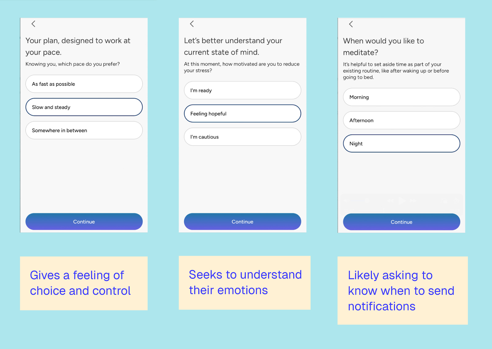
Here’s how Calm does this at the very start of the flow:

And then later, when they ask about your experience with meditating:

Finally, they give users a sense of control throughout the entire flow:
What to steal
Before you explain what your product does, show users that:
Their problem is normal
They’re not alone
They won’t be judged for where they’re starting
Anxiety drops, openness goes up.
2. PlantIn: “You don’t need to know everything.”
PlantIn, the AI plant app, has a landing page that does something subtle but powerful: it never assumes competence.
Instead of rushing users to convert, it:
Explains concepts slowly
Repeats value in different ways (statistics, deeper pages)
Uses content to quietly say, “We’ll guide you”
For people who feel like they’re “bad at plants,” this matters more than the AI itself.

What’s great about PlantIn is that it doesn’t rush users into conversion; the focus is on getting them to sign up and trust PlantIn.
It offers a wealth of in-depth pages that explain more, like showing plant types, plant diseases, and even mushrooms you can identify.

This doesn’t take away from the app’s core value — the ability to identify plants with confidence — it strengthens it.
With a database of over 7,000 plants, the capability is there, but trust is what keeps users coming back.
What to steal
If your users might feel inexperienced or overwhelmed:
Use content to reduce self-doubt
Show examples and explanations before asking for action
Make exploration feel safe
3. YNAB: “We won’t ask for trust before you’re ready.”
YNAB, the budgeting app, asks users deeply personal questions about money — high-anxiety territory.
So they delay every big ask:
No pricing upfront
No app push
No bank connection until users feel invested
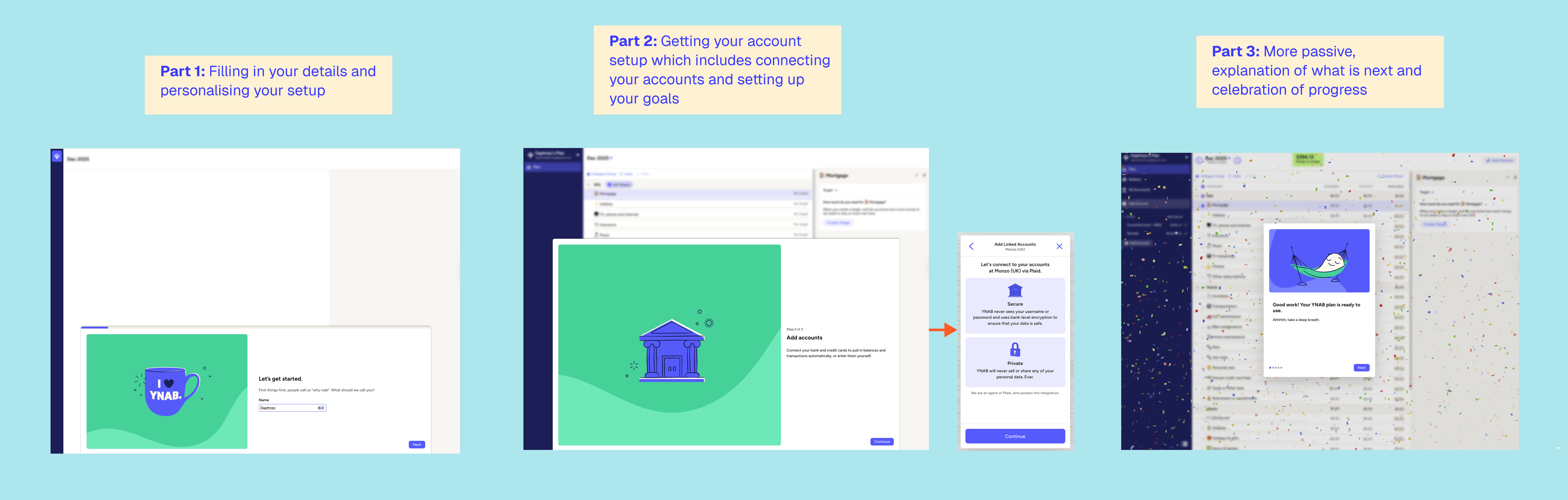
They let confidence build before risk appears. They start with high-level, easy questions in part 1 of the onboarding:

They don’t ask for the tricky stuff, like connecting your bank account, until part two — after you’ve answered 15+ questions.
What to steal
Look at your funnel and identify:
The first “high-trust” moment
The first “this feels risky” step
Then ask: Have I earned their trust yet?
If not, test moving it to a later time.
Recommendation
In every edition of Growth Waves, I also share a resource to check out related to the week's topic.
This newsletter is based on a longer article I wrote for RevenueCat, breaking down five web-to-app funnels and why they work.
It’s the longest article I’ve ever written — 5,000+ words!
Learning how to reduce anxiety is just one takeaway. In the full article, you can see the complete flows of Calm, PlantIn, YNAB, Photoroom, and Blinkist, along with key lessons you can apply from each one.

If you’re designing or optimising a web-to-app flow, it’s worth a read.
When a funnel underperforms, it’s tempting to add urgency, proof or pressure.
But the better question is often simpler:
Where might this be making someone feel unsure, exposed or overwhelmed?
Design for emotional safety first. The metrics usually follow.
Till next time,
Daphne
I feel like this is so much more important for AI products where trust is very low..